
When you take a look at companies with the best brand recognition worldwide like Amazon, Apple, Google, Samsung Group and Facebook, immediately their logos, brand personality, typography, abbreviations, etc. can be vividly recalled in your mind – from the black Amazon wordmark underlined with its yellow “smile” to Facebook’s blue ‘f’. If placed next to each other, it’s highly likely that you’d be able to distinguish between Samsung’s ‘SamsungOne’ font and Google’s Sans-serif typeface. An Apple advert whether online or on a billboard is always distinctly an Apple production.
While a brand’s value is made up of many things - internal culture, customer service, brand tone of voice and mission statement, a company’s visual brand assets play the most obvious role in establishing a brand, differentiating it from competitors and getting the consumer’s attention, business and loyalty.
The enterprises that make it onto brand value tables are indeed masters of effective brand design. However, they are acutely aware that they need to think beyond great design to secure their place in the consumer’s mind. These global leaders take incredible care and invest resources in the consistent implementation of their unique brand look on all communication channels, whether social media, newsletters, websites, TV ads or office signage. They know that brand value is built on consistency.
This mix of a company’s visual brand assets and their correct implementation are at the heart of the all-important tool that empowers a company to become memorable, outstanding and more lucrative - the brand style guide.
What is a brand style guide? And why do you need one?
A brand style guide (also known as a corporate brand identity manual) groups together all the elements that make up a brand’s visual identity, such as its logo, typeface, image guidelines, and color palette. It also includes implementation instructions for exactly how these brand assets should be used in different settings to mirror the brand voice. A comprehensive style guide should make as much sense to the IT department as it does the design team and digital marketing department.
The best brand style guides aim to rule out any inconsistencies in visual communication.
Just as consistent visual language builds a strong brand, brand value is damaged with the inability to deliver a clear visual identity. Common examples of such crimes against brand identity style guides include the likes of the circulation of old logos or taglines, employees using a wide variety of conflicting fonts, off-brand images and a clashing (or even worse, a competitor’s…) color palette.
Choosing a wrong font color may seem trivial in the grand scheme of your marketing plans, but its effects are not. At best, veering away from a clear visual identity means you won’t stand out from the crowd. At worst, it produces a confusing consumer experience, influencing how authentic a brand appears and affecting the trust (and spending habits) of an audience. A clear set of visual guidelines keeps your team and company on track to deliver consistent brand experience.
If you’re in the process of updating or creating a brand style guide, we’ve put together a handy list of what to include, along with examples of businesses offering their employees the best brand style guides around.
Brand style guide element 1: the logo
Often viewed as the ‘face’ of a brand, a logo is the starting point and most obvious graphic element of a brand’s identity - think McDonald's golden arches, Nike’s swoosh, Twitter’s bluebird. Whether a symbol, wordmark or mix of both, it’s usually the first asset a consumer comes into contact with, as well as being the most viewed, and has the weighty task of conveying a brand’s entire positioning, story and messaging.
Read next: The elements of a successful logo design in 2018
Brand style guide examples: Netflix

You can view Netflix’s detailed web brand style guide any time here but below are some main ways the company executes logo treatment so well.
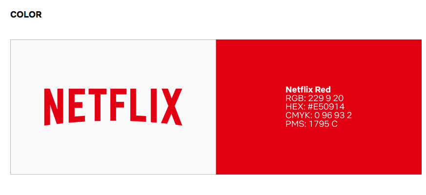
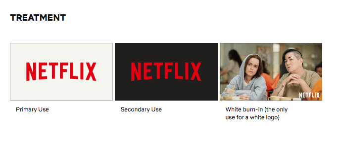
Netflix explains the relevance of its ‘iconic’ logo, with its ‘arc of a Vintage CinemaScope’ as reflecting the nature of its business. The online brand style guide outlines the exact color codes and examples of logo placement to foster brand consistency. There are clear definitions of its layout, including margins and padding, as well as different treatments and dos and don'ts.
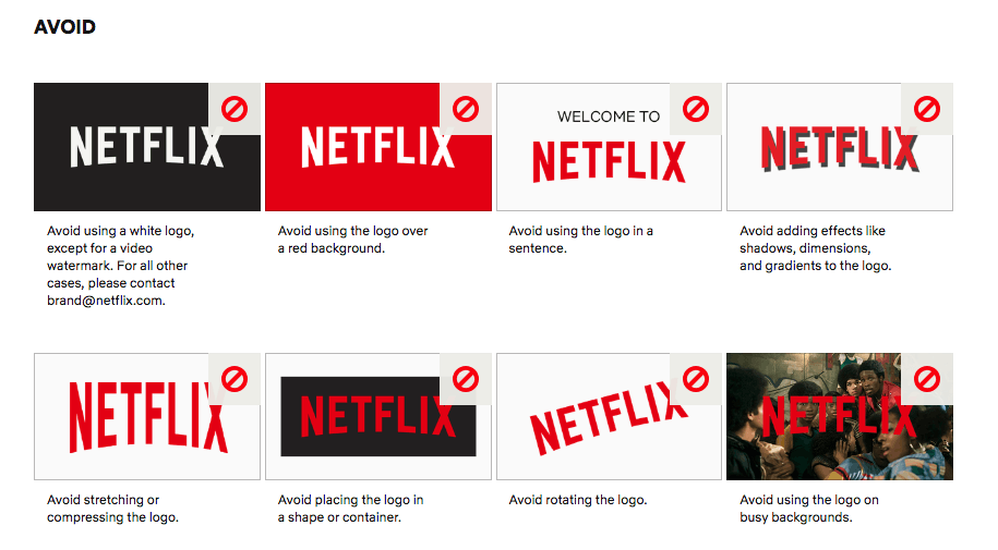
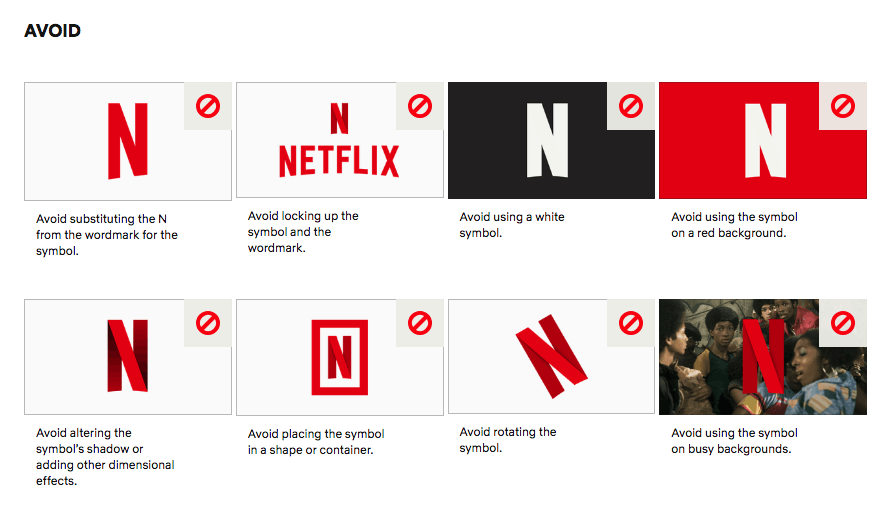
Netflix’s online brand book also has a detailed section on their new ‘N’ logo, explaining the logistics of its use but also clarifying when old vs new logo should be used. As all leading global brands understand, in today’s fast-moving markets, it’s key that logos are updated to work with ever-expanding channels and services. Further, all branded materials, documents, and marketing initiatives should adhere to a strict set of standards.
So, like Netflix’s, a brand style guide should never be static: regular updates to a stylebook should include new assets that drive a brand forward.
Brand style guide element 2: typeface
If a logo is the most obvious graphic asset in your visual brand language, a typeface will be its most far-reaching - appearing everywhere from emails to contracts, social media designs to office stationery.
Your typeface should complement the logo and help develop the brand story. Bespoke typefaces are being used more and more in editorial style guides in an effort to ensure that, just like a logo, when viewed in isolation, the brand itself is immediately thought of.
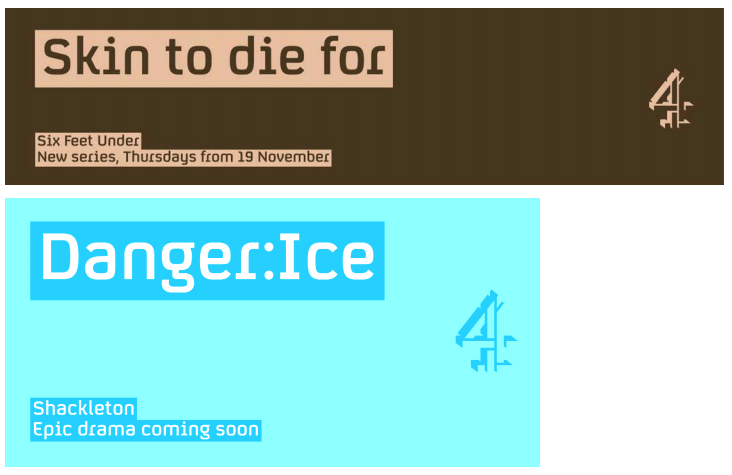
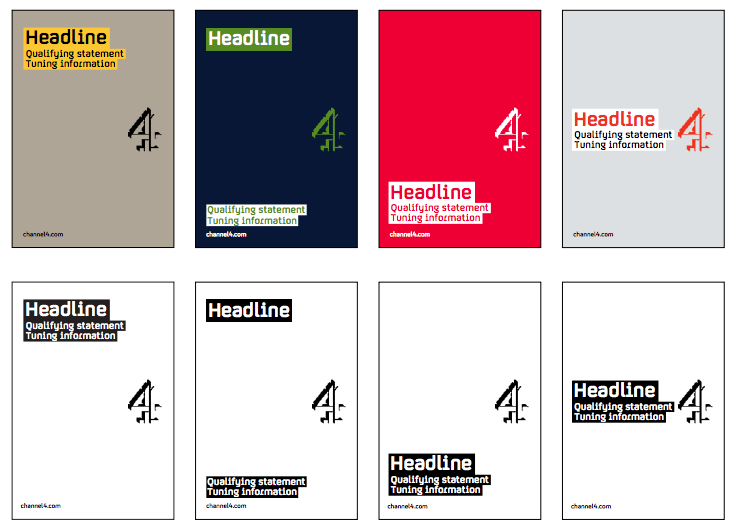
The in-depth brand style guideline of Channel 4 - a UK broadcasting station, is an excellent example of the detail gone into by successful businesses to ensure brand consistency. It covers everything from print and digital ads to the way URLs should be displayed. It is particularly thorough in its coverage of brand typeface.
Channel 4’s online brand guidelines cover not just its primary font, but also includes the following aspects:
- 12 hierarchical fonts used when communicating as the brand
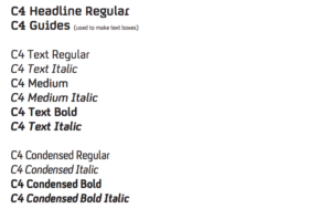
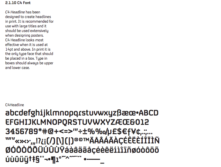
- C4 Headline font
- The design ‘raison d'etre’ of the font is explained
- The alphabet previewed
- Its usage outlined
- Easy to understand examples provided for how it looks in different situations
Channel 4 uses a combination of the Chicago Manual of Style, Associated Press, and its own house styles which can be confusing. However, all this detail leads to no doubt as to how a brand uses this font family. Additionally, this comprehensive editorial style guide is a living document that speaks to headings, abbreviations, spacing, and so much more.
Brand style guide element 3: imagery
Many brands fall short in their brand style guide by focusing on hero visuals, such as the logo and typeface, and ignoring other everyday brand assets used by employees such as imagery.
Images are powerful elements of a brand’s visual identity, whether featuring on social media posts, above the line advertisements or new business pitches. It’s vital that employees (especially content creators and digital marketing teams) have a bank of on-brand photography and/or illustrations to work with, or alternatively are given a crystal clear brief on a company’s image direction.


Brand style guide examples: Urban Outfitters
You’d be hard pushed to come across a brand style guide as visually appealing as Urban Outfitters’. As a whole, it is another standout example of a thorough, detailed brand visual guideline detailing corporate style and design standard. However, what it really excels at, is its approach to company imagery.


A real sense of Urban Outfitter’s image direction is given through the inclusion of on-brand images throughout the entire brand style guide - not just the imagery section. There is a page dedicated to the brand’s photography methodology, informing the reader that imagery “is not merely advertising and look books” but acts to “build an emotional connection with the brand” through cultural diversity, the avoidance of studio shoots and ‘live’ emotive shots. Photography is handily divided into three categories to clarify Urban Outfitters’ direction further.
Brand style guide element 4: color palette
Color is another powerful component of a brand’s visual identity. Brands can be defined by their choice of color - Facebook’s blue, Starbucks’ green, Netflix’s red. In fact, according to the Institute of Color Research, people make subconscious judgments about products based on their color in just 90 seconds. It’s vital to make sure you have your color palette locked down in your brand style guide, so employees are constantly communicating with your visual language.

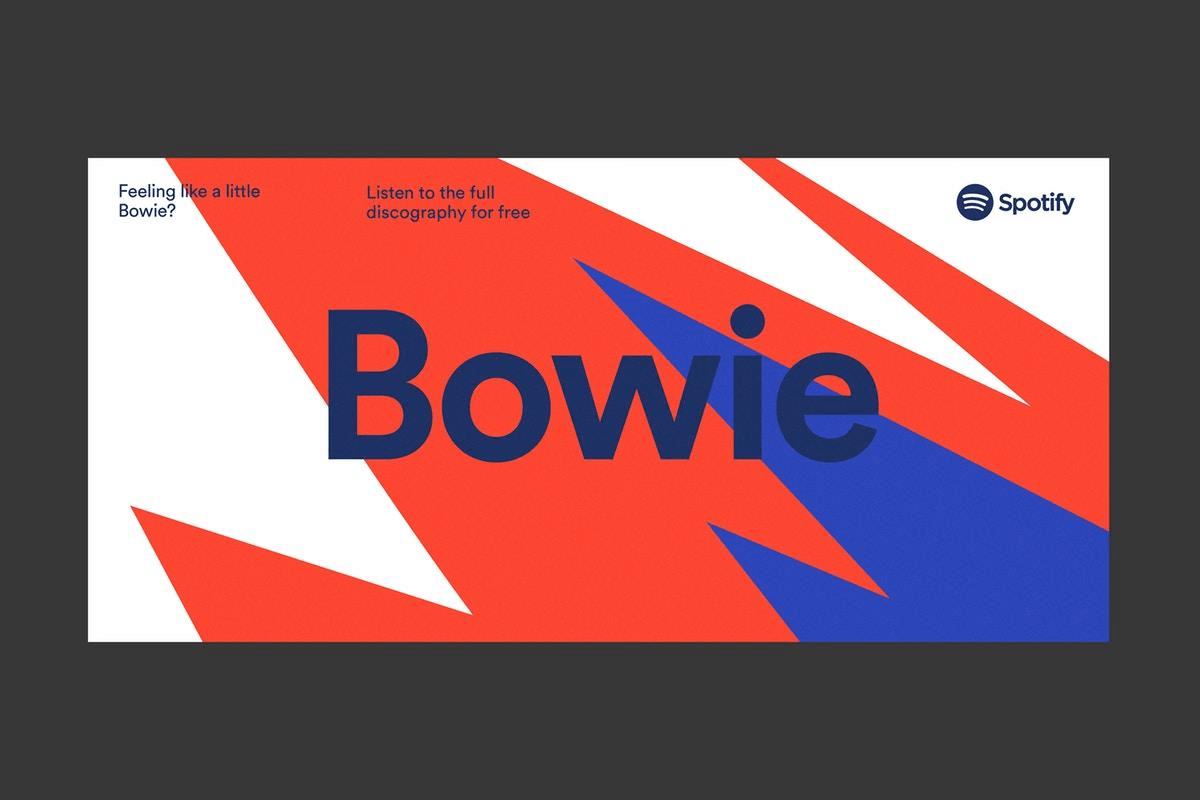
Brand style guide examples: Spotify
Giving your employees a set of colors to stick to doesn’t need to be a restrictive process - as demonstrated by Spotify’s recent rebrand. To reflect the business’ transition from a technology provider to a vibrant entertainment brand; the company took its two-tone color scheme of white and green and expanded it to 31 bold colors.
While 31 may seem counter-productive to creating a unified brand identity, the brave brand management strategy thoroughly paid off through its use of filters and block coloring. Spotify’s design agency Collins also have specific examples of how to use the color palette, so the Spotify team don’t fall back on personal interpretation of the brand style guide.

Brand style guide element 5: implementation
A common theme that runs through all these best practice brand style guides is implementation. A lot of hard work goes into the creative process of branding a company. However, the real work and challenges start after a brand style guide is put together. This is where your logo, typeface, images and color palettes exist in the real world and can either be used to increase or conversely weaken your brand value.
It’s always crucial to remember that your employees are your brand ambassadors. They are the people on the frontline communicating in your brand’s visual language every day to your target audience, customers, partners, and more.. Templafy's document automation software provides an end-to-end solution for brand compliance issues and promoting brand consistency across all communications.
Below are a few ways in which Templafy can assist in effective brand style guideline implementation:
- Roll out: It’s not just billboard ads and social media marketing that need to be showcasing brand style guides correctly. Make sure your brand world is consistent across all touchpoints - both internally and externally. Update everything including email signatures, spreadsheets, contracts, presentations stationery and office signage. Tools such as Templafy act to automate your brand style guide, rolling out changes no matter how big or small in real-time, enterprise-wide.
Brand Managers simply make their updates via the centralized Admin Center and all changes are instantly made to the countless documents and emails sent by your team.
- Centralization: Giving all employees control over brand assets is a huge risk to brand compliance, with individual interpretation and document management habits varying greatly. Templafy’s enterprise document management software allows brand managers to make brand assets and on-brand document templates readily available to employees. That way, Brand Managers always know what brand elements are in circulation and that teams, departments, and individuals are implementing the brand style guide as intended.
- Access: Easy access to brand visuals is crucial for successful implementation. Create a central hub for all pre-approved content and make sure it’s easily found with sophisticated search functions or categorization to save employees time and avoid any risks to brand compliance.
Deep integrations with Digital Asset Management (DAM) software mean Templafy can provide access to all images and brand elements in your company’s DAM system of choice. Templafy’s cloud-based solution also offers 24/7 access to image libraries and all centralized content – from document templates to fonts. Employees can create on-brand content wherever they are, whenever they need to.
- Monitoring: Keep on top of how your brand world is being used. You can’t expect to publish a brand style guide and assume busy employees will be executing it correctly. Templafy allows you to validate documents with tools that ensure off-brand content is automatically detected, and the correct, on-brand options are presented to keep your brand on-brand.