Maria Toft works at SkabelonDesign, a close partner of Templafy’s (we’re even located in the same office!). If you think you spend a lot of time in PowerPoint, think again. Maria has over 20 years experience consulting in Microsoft PowerPoint design and implementation – amazing when you consider that the very first version of PowerPoint was only launched in 1990.
We asked Maria to let us in on some of her PowerPoint secrets and tips so that you don’t have to spend 20 years mastering them!

Slide layouts are the cornerstone of efficiently creating presentations. In your opinion, what are the core layouts essential to having a great slide deck?
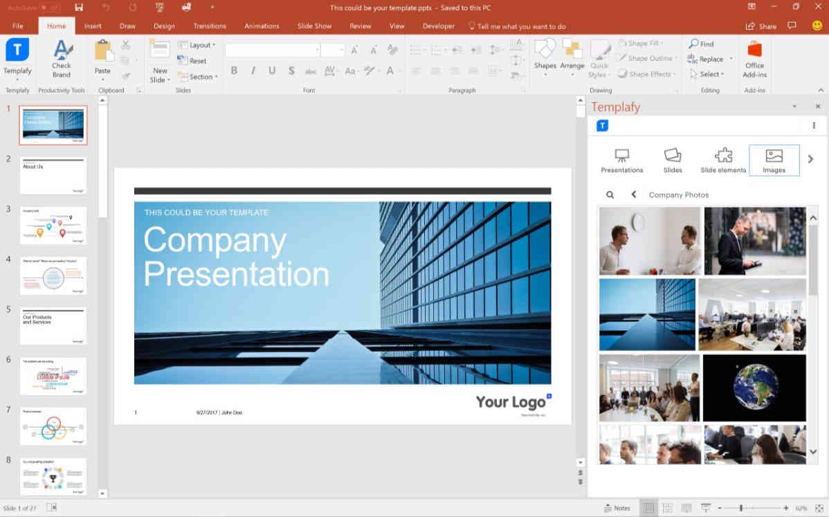
Yes, having well-designed slide layouts saves employees a lot of time creating presentations from scratch. The layouts are found in the drop down of the ‘New Slide’ button or you can change the layout on a slide using the ‘Layout’ button.
Microsoft Office and Office 365 come with preset slide layouts, but it’s best that you customize these for your own needs. The fundamentals that every slide layout deck needs are the following:
- Front, First slide and Intro slide layouts: here you can have a header, picture, and short text.
- Content / Text layout is useful for all kind of slides: text, table, chart, SmartArt even video.
- 2 x Content slide layouts: use this slide if you what to explain a table, fig. or chart, or just want text in two columns.
- Divider: make a break or intro to the next chapter of your presentation, awake the listeners attention. Nice for the eye to see a clean slide with little information.
- Text + image: speaks for itself. Always use picture-placeholders for inserting picture. They keep their size ratio and placement and the design on the slide will be intact.
- End slide: makes a good completion of your presentation and exit of your presentation.
Tip: it’s simple but so important to name the slides properly so that people can find them
What are your favorite shortcuts?
- Text styles – there are 9 text levels! To go from text level 1 to 2: click Enter for new line if you have written text in first level and then Tab, keep hitting Tab until you reach the right text style. Use Shift+Tab to jump back in text styles. Alternatively you can use the top ribbon button by clicking Decrease… / Increase through the List Levels be used to jump through levels.
- Keyboard shortcuts – to jump through placeholders use Ctrl+Enter to jump from the active placeholder to next content box.
- New slide - Click Enter for creating a new slide with the same layout as on active slide.
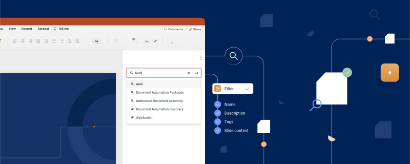
What are examples of why a company should use Templafy?
- Content placeholder – inserting images from the picture placeholder makes the images weird sizes. Using Templafy, the image resizes automatically.
- Templafy makes it easy for all employees to reuse slides again and again, and in a good order.
People often struggle to send PPT files because of the size. Have you got any tips to reduce PPT file size?
- Keeping it smaller. You can compress pictures but this will affect the quality of the pictures. Don’t compress all pictures in a file at once because then your logo might suffer. Using JPEG is best because it’s already a compressed image file.
- Graphics are the only thing that increase the file size.
- Adding transitions will not increase the file size.
- Also if you have used slides from old presentations, some extra layouts (from the old presentations) might have entered the Master. Delete those. If that is not possible, go to the slide using the layout and choose a correct layout from the Master, then delete the old layout.
What do you think is one of the most underrated features of PowerPoint?
Animations and Transitions can be used to highlight the conclusion, make the presentation alive by loading slides and making animated elements appear in a way that support your message. Find the features under Animations and Transitions tabs.
Tip: Remember to view the animation pane when work with animations, which can be found after clicking on the animation tab. And try out the amazing Morph-transition which can make a movement of several elements from one slide to the next.
What are some "don'ts" when using PowerPoint?
- A transparent color looks terrible in printed view. A solution is to save it as PDF and print. Never print ppt with transparent colors.
- Picture file formats – do not use TIFFs, use JPEGs. Use PNGs if you want the picture transparent on the background.
- Do not use too many different transitions – only use one or two. People’s brains get tired otherwise.
- Don’t change the size of the header. Make short headers instead. It’s incredibly disturbing and distracting to watch.
- Don’t use light colors for charts. Because if you present in a light room, then your chart won’t show. Use contrasting colors.
- Make short texts, better to have more slides than too much info on one slide.