
Learn the differences between corporate branding and product branding as we explore some of the best corporate branding examples of the last 20 years.
If you are in the advertising/marketing/branding world and enjoy watching TV, you have probably watched all or some of Mad Men—if not, add it to your list.
The “Mad” in Mad Men ostensibly stands for Madison Avenue, the New York City street that is synonymous with the advertising industry. But it also suggests something of the storyline that developed over seven seasons about the fictional Sterling Cooper ad agency and the mad lives of its copywriters, designers, account executives and secretaries. Additionally, it’s an apt reference to the madcap pace of the time—the 1960’s—when advertising went through a creative revolution, producing campaigns that are still considered among the best of all time.

As it happens, the ‘60s was also when branding—corporate branding, product branding, corporate identity—really came into its own. Advertising had always been about product branding one-upmanship: getting buyers to see why Brand X was superior to Brand Y.
But by the time of the Mad Men era, marketers realized that so many similar products made it hard to really promote one over another. They came to see the buying decision as more about emotions and the customer experience than reasons. For people to consistently buy a product they first needed to identify with it, trust it and, most important of all, feel better about themselves because of it.
Branding—both corporate and product branding—is all about evoking and maintaining these feelings. When branding is done right, it harnesses all the elements of marketing communication—messaging, words, graphic design, color palette, illustrations, photos, icons, typography, product packaging, placement—to prompt an instant recognition on the part of the consumer and build that emotional connection. That’s why corporate branding and rebranding is often best when it stirs rather than shakes a consumer’s emotions.
Opportunities for branded communications are growing dramatically
Back in the Mad Men era, the opportunities to engage in branded communication with customers and potential customers were relatively limited and highly controlled. The early corporate branding strategists were almost always consumer products companies – detergent, personal care, food. They were the ones with the big advertising budgets and marketing campaigns.
But the emotional basis for buying also applies to the bank you use, the computer you buy, the professional services firm that provides advice to your company, the law firm that represents you. And the opportunities for branded communications now go far beyond advertising.
Today, all companies that are serious about their corporate branding and product branding need to reinforce it in all their communications, from the emails and letters they send to clients and prospects, to their websites, brochures, presentations and more.
For many firms today, such as consultants, lawyers and others in professional services, their actual products—research, reports, analyses—are in fact modern examples of corporate branding.
Read next: What corporate branding really is and how it differs from smaller organizations
The Big Challenge: Managing the Brand
And while a lot of work goes into the initial development, corporate brands and product brands aren’t set it and forget it. Markets change. New competitors appear. You open new offices, expand into different regions, introduce new products. All of this typically requires adapting and extending brand positioning, images, messaging, and more.
That’s what makes corporate branding such a challenge. Over the years, companies have relied on brand guidelines documents and teams of brand managers. That’s not going to change. But to meet the challenge of brand management today you need automated tools.
That's where Templafy comes in. Templafy is a cloud-based solution that helps you get all the elements of both your corporate brand and product brand working correctly across your communications. That includes graphic design elements, new logo designs, color palettes, typography, and much more.
Whether it’s an email, a sales presentation, a proposal, a contract, an advertisement, a report—whatever the document—Templafy provides you with a system you can rely on to deliver the look, feel and content that consistently conveys who you are and what you stand for. And as your brand strategy evolves, Templafy is right there to help manage and simplify the evolution.
What are some of the challenges today that put pressure on brand management?
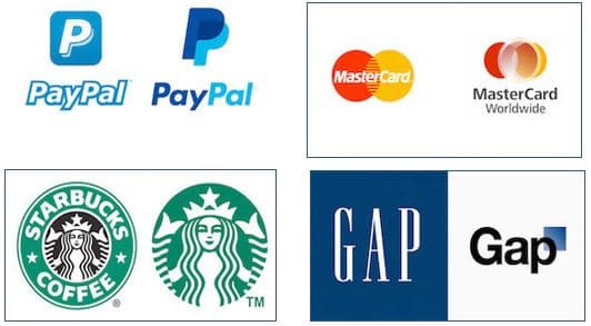
Consider the case of PayPal. Back in the late 1990s, PayPal was the new kid on the block—the leading digital payments company for the new world of online transactions. Then along came mobile phones and a host of new competitors offering mobile payment services. Suddenly PayPal was an “old school” payment processor for PC-based transactions. PayPal responded with a host of new mobile-oriented capabilities and by overhauling its brand image.
PayPal didn’t throw the baby out with the bath water. In fact, it was mindful of the largely negative reception accorded to another major player in payments—Mastercard—which in 2006 had dramatically altered the interlocking red and yellow circles in its logo (with the help of the design firm Pentagram, Mastercard has since restored the circles to reflect more of their original concept).
PayPal kept many aspects of its original look, but it significantly updated them—with a new angular format, a new typeface for the wordmark (Futura), and a refreshed color palette—to make a stronger connection to users in the place where it mattered most: on the screen of a mobile phone.
While PayPal is a great example of a corporate entity with a successful brand adapting to the new realities of the marketplace, sometimes you need to make the marketplace respond to you. This was the case at Starbucks. Over the years, the famous Seattle coffee roaster has repeatedly tinkered with its logo design and packaging. In 2008 Starbucks swapped out green for black in its iconic mermaid/siren logo and added tea to coffee in its word mark. The changes in its visual identity and brand design were not popular. Starbucks was in a chastened mood when three years later it decided to rebrand again, this time to celebrate its 40th year.
Starbucks was also mindful of a branding disaster that had just enveloped Gap. In 2010 the famous casual clothes company suddenly dropped its 20-year old logo—the solid blue box with "GAP" in a capitalized serif font—replacing it with sans serif Helvetica and a blue semi-transparent square over the P. Consumer reaction was negative and the new look was gotten rid of after all of six days.
Starbucks approached its 2011 corporate branding strategy gingerly, but ultimately made a much more radical innovation: the green palette stayed and so did the mermaid, but it removed the enclosing circle and, in a real sign of its ambitions, completely dropped its name.

Corporate Branding vs Product Branding
Both PayPal and Starbucks take what’s known as a Branded House approach: they have a single, unified corporate and product brand. As a result, they both went to work applying the new look everywhere. For PayPal that meant overhauling its online and mobile applications, 'PayPal Here' devices, sales and marketing materials and the company’s first ever global advertising campaign.
Starbucks rolled out its new comprehensive visual strategy at all its stores, merchandise and advertising. Interestingly Starbucks often mixes things up with off-center applications of the logo. But it’s both instantly recognizable and through the controlled variations, remarkably consistent—the critical elements of brand success.
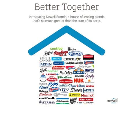
An alternative to the PayPal/Starbucks Branded House approach is the House of Brands strategy: giving every product or service its own brand. You have probably never heard of the company Newell, but you may have cooked dinner in a Crock Pot, used Elmer’s Glue on crafts projects, gone camping in a Coleman tent or lit the darkness with a Yankee Candle. Those are all offerings of the Newell company with their own product brand identity: logo designs, color palettes, taglines. They provide great product branding examples because you would never know they are part of one corporate entity—which is really the point. Unlike companies like Apple or Nike, there is really no crossover value or synergy which means there are likely very few economies of scale in branding Elmer’s Glue as part of the same company as Yankee Candle. They are very different markets with different requirements and the best product branding recognizes this.
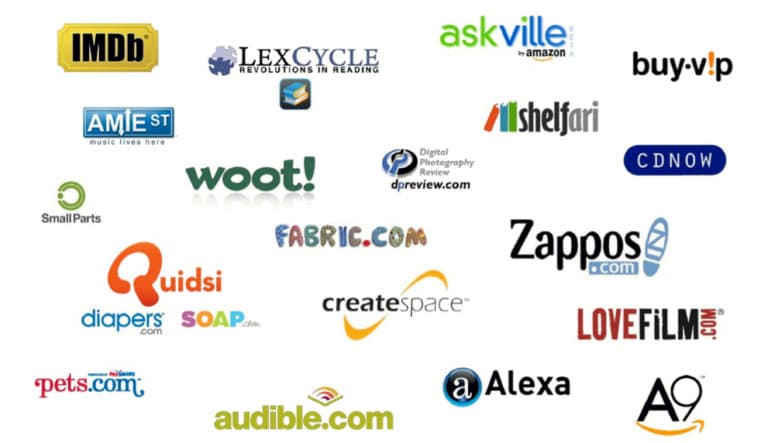
Interestingly, Amazon has followed a middle path in the corporate brand vs. product brand decision. As it has acquired new online venues—Audible, Pets.com, Zappos—it has retained and even enhanced the original logo for these services, sometimes adding the Amazon logo or “An Amazon Company” as a tag. This approach can be more challenging to maintain, requiring more resources, but also allows for more upside growth if the sub-brand really takes off.
Execution is Everything
As all the above examples illustrate: corporate brands and product brands are living, changing things. In part that’s because society is always changing: what it took for a brand to make an emotional connection to a Baby Boom buyer in 1968 is a lot different than what it takes to appeal to an Instagram-obsessed Gen Z-er nowadays.
But as the changes by PayPal and Starbucks show, as your company, stakeholders, target audience, and markets evolve, your brand image, messaging, and marketing strategy needs constant care and feeding. This may even require the courage to admit that you got it wrong—the way Starbucks did in 2008 and Mastercard and Gap did in 2006 and 2010.
Even in the absence of any significant changes in your market, lack of attention to the day-do-day management of your corporate and product brands allows inconsistencies and misapplications to occur, detracting from their core values and mission statement. This is true whether you’re a Fortune 500 company, startup, or growing small business. Here are some examples:
- You hire a new digital marketing, advertising, or branding agency. To make a name for themselves and demonstrate their value, they try to alter core values or elements of the brand.
- You bring on new employees who aren’t familiar with the original thinking behind the brand.
- You rely on an extended network of freelance talent for graphic design, social media management or copywriting who fail to correctly follow guidelines.
- You extend the corporate brand to a new product (Branded House vs House of Brands discussed above) and find that you now need new guidelines solely for this new product line.
- You introduce the brand into a new territory and need to make some adjustments based on local concerns over language, attitudes toward color, photography, illustration and other elements.
Templafy was specifically designed to give you the tools you need to address all these brand management challenges.
With Templafy you can now rely on:
- A one-stop-shop access point for all your on-brand and legally compliant digital assets.
- Centralized, cloud-based distribution of these assets throughout your organization to different business units and office locations.
- Seamless integration of your core brand assets within applications such as Microsoft Office 365.
- The ability to dynamically customize and even personalize company brand templates to the needs of different business units, location and even individual employees.
- Built-in checkers to ensure that brand assets such as fonts, company colors and logos are compliant and up-to-date.